Responsive Web Design (RWD) is a design approach where your website layout, images, and content automatically adapt to different screen sizes and resolutions. No more pinch-zooming. No more broken layouts. Just seamless browsing.
Your users are everywhere — on phones, tablets, laptops, desktops, and smart TVs. A responsive website ensures your brand looks amazing on all of them.
Mobile-first indexing by Google
Higher engagement & Conversions
Lower bounce rates
One site to rule them all - No need for separate mobile versions
Why Choose Us?
Designed for Humans, Not Just Screens
Intuitive Navigation
Users find what they need quickly with clear, user-friendly navigation.
Consistent Branding
A unified visual identity that strengthens brand recognition across every page.
Fast-loading Pages
Optimized performance ensures a smooth experience with minimal wait times.
Accessibility-first
Designed for inclusivity, ensuring access for users of all abilities.
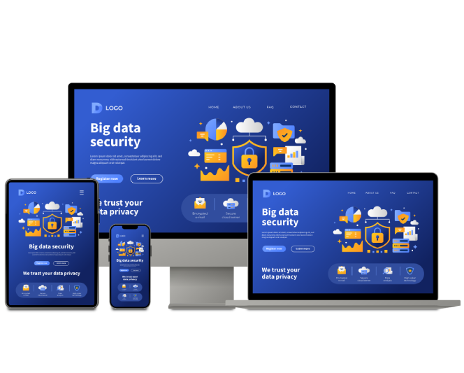
Responsive Web Page
Tailored for your Business
Every business is unique, and so are our solutions. We build dynamic pages for:
Corporate Websites
Build trust and showcase your brand with sleek, professional web presence.
E-commerce Stores
Drive sales with fast, secure, and conversion-focused online storefronts.
Educational Platforms
Engage learners with interactive, scalable, and user-friendly solutions.
Healthcare Portals
Enable secure, patient-friendly access to healthcare services and vital information.
Startups & Agencies
Launch fast with agile, scalable websites built for growth and innovation.
Mobile-First Campaigns
Deliver seamless user experiences across all platforms, starting with mobile.


